A modern single-page redesign of the Zila Seba app landing page — React 19, Vite 8, Tailwind CSS 4, zero UI libraries.
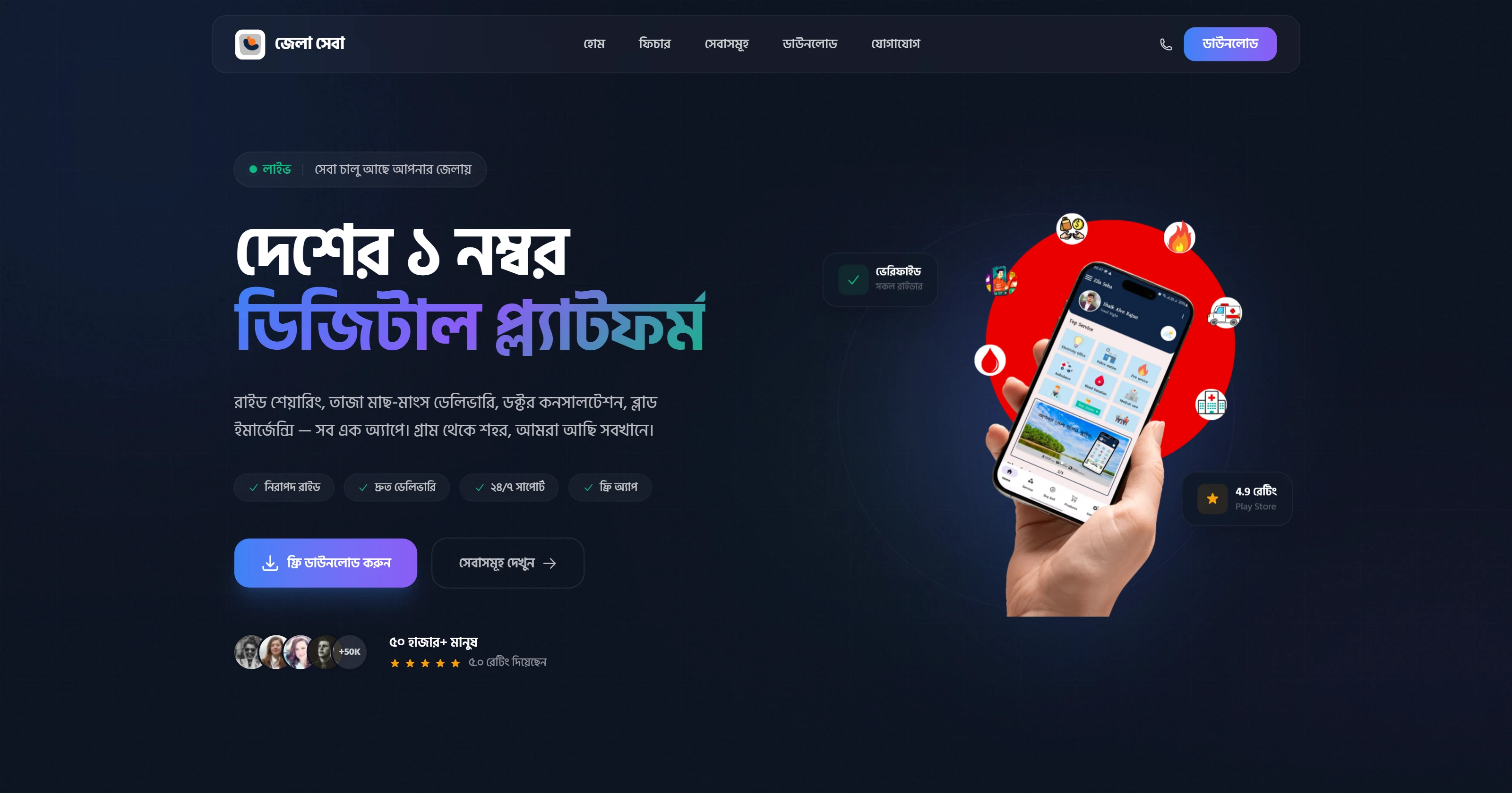
Zila Seba is a Bangladeshi local digital services platform — think utility bill payments, government form submissions, and civic services through a single app. The original landing page was functional but visually dated. This redesign reimagines it as a dark, modern product marketing page with a bento grid layout, scroll-triggered count-up statistics, and motion built entirely in pure CSS. No animation libraries. No UI component kits.
Visit zilaseba-redesign.vercel.app to see the full redesign live. Scroll past the hero to trigger the count-up stats animation.
Overview
The redesign had a clear brief: make Zila Seba feel like a product worth downloading. The original used a light background, generic stock illustrations, and static text blocks. The new direction is a dark luxury aesthetic — near-black backgrounds, a blue-green accent that matches Bangladeshi state branding, and a bento grid that communicates the platform's breadth of services at a glance.
Every animated element — the count-up stats, the floating phone mockup, the infinite logo marquee — is implemented with Tailwind v4 CSS utilities and @keyframes declarations. React 19 handles component composition and scroll event binding, but does no heavy lifting here. The constraint was intentional: prove the design system does not need Framer Motion, GSAP, or any third-party animation package.
No Headless UI, no Radix, no shadcn/ui, no Framer Motion. Every component — including the count-up stat blocks, the marquee, the mobile nav — is hand-written from scratch. The only runtime dependencies are React and React DOM.
Design Decisions
The original landing page used a white background with light blue accents — readable, but forgettable. The redesign flips to a dark foundation for several deliberate reasons:
- Dark backgrounds make brand-colored UI elements (teal buttons, icon glows) pop without additional decoration
- Government and civic apps rarely use dark mode, so the contrast positions Zila Seba as modern and tech-forward
- A dark theme simplifies the illustration layer — phone mockups float without needing dropped shadows or cutout masks
Typography pairs Hind Siliguri (for Bengali script) with Inter (for Latin UI text). This is the first time a typeface decision actually matters for this project — Zila Seba's core audience reads Bengali, and most western-facing landing page templates give zero consideration to Indic script rendering.
The bento grid replaces a standard feature list. Instead of five bullet points under a heading, each service category gets its own card with an icon, a label, and a hover state. The grid is asymmetric: larger cards anchor corner slots, smaller ones fill the interior. This creates visual weight without needing a separate hero illustration.
Features
| Feature | Details |
|---|---|
| Bento grid layout | Asymmetric service card grid with hover lift animations |
| Count-up statistics | Numbers animate from zero on first scroll into view, triggered by IntersectionObserver |
| Infinite logo marquee | Continuous horizontal scroll of partner/service logos via pure CSS @keyframes |
| Floating phone mockup | Phone image with subtle CSS float animation; no JS animation library |
| Bengali typography | Hind Siliguri renders the Bengali script portions of the UI correctly |
| Mobile-first responsive | Single-column on small screens; bento grid activates at md breakpoint |
| Pure CSS animations | All motion implemented with Tailwind v4 utilities and @keyframes — zero JS animation |
| Zero UI libraries | Every component hand-written; only runtime deps are React and React DOM |
Tech Stack
| Tool | Role |
|---|---|
| React 19 | Component composition, scroll event binding for count-up trigger |
| Vite 8 | Build tooling with first-class React and Tailwind support |
| Tailwind CSS 4 | CSS-first config, design tokens, all utility styling |
| Google Fonts — Hind Siliguri + Inter | Bengali script and Latin UI typefaces |
Pure CSS @keyframes | Marquee, float animation, hover transitions |
Component Architecture
src/
├── components/
│   ├── Header.jsx         # Sticky nav with mobile drawer
│   ├── Hero.jsx           # Headline, CTA, floating phone mockup
│   ├── Stats.jsx          # Count-up stat blocks
│   ├── Platform.jsx       # Bento grid service cards
│   ├── DailyJourney.jsx   # Service cards section
│   ├── Safety.jsx         # Safety features + merchant CTA
│   ├── BloodEmergency.jsx # Emergency blood banner with pulsing icon
│   ├── AppDownload.jsx    # App store download CTA
│   ├── MediaCoverage.jsx  # Infinite logo marquee
│   ├── Testimonials.jsx   # User reviews
│   ├── ServiceAreas.jsx   # Coverage map section
│   ├── Contact.jsx        # Contact form
│   └── Footer.jsx         # Footer with links
├── hooks/
│   └── useCountUp.ts      # IntersectionObserver + rAF counter
└── index.css              # @theme tokens, @keyframes declarations
Count-Up Implementation
The stat counters animate on first viewport entry using a custom hook that combines IntersectionObserver with requestAnimationFrame. The hook is pure — it takes a target number and duration, returns the current display value, and cleans up automatically.
src/hooks/useCountUp.ts
import { useState, useEffect, useRef } from 'react'

export function useCountUp(target: number, duration = 1800) {
  const [value, setValue] = useState(0)
  const ref = useRef<HTMLElement>(null)

  useEffect(() => {
    const el = ref.current
    if (!el) return

    const observer = new IntersectionObserver(
      ([entry]) => {
        if (!entry.isIntersecting) return
        observer.disconnect()

        const start = performance.now()
        const tick = (now: number) => {
          const progress = Math.min((now - start) / duration, 1)
          const eased = 1 - Math.pow(1 - progress, 3) // ease-out cubic
          setValue(Math.round(eased * target))
          if (progress < 1) requestAnimationFrame(tick)
        }
        requestAnimationFrame(tick)
      },
      { threshold: 0.5 }
    )

    observer.observe(el)
    return () => observer.disconnect()
  }, [target, duration])

  return { ref, value }
}
The easing curve (1 - (1 - t)^3) gives the count-up a fast start and smooth deceleration — it reads as confident rather than mechanical.
Before and After
The redesign addresses specific weaknesses in the original page:
| Aspect | Original | Redesign |
|---|---|---|
| Visual tone | Light, generic | Dark, product-forward |
| Layout | Static feature list | Asymmetric bento grid |
| Typography | Single Latin font | Hind Siliguri + Inter pairing |
| Motion | None | Count-up, marquee, float — pure CSS |
| Perceived quality | Functional | Premium |
| UI library usage | Untracked | Zero — all hand-written |
This is an independent redesign built for learning and portfolio purposes. It is not affiliated with or endorsed by the original Zila Seba app or its owners. All trademarks and brand assets belong to their respective owners.